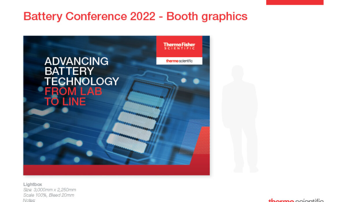
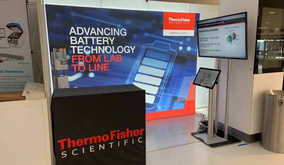
Battery Conference Installation
The Battery Conference booth installation was just a portion of the project work. Other pieces I helped design included event email signatures and headers to register for the conference in both English and German, and a website landing page banner. The challenges I faced with this project were that the imagery, text, and branding were not fitting cohesively together. The battery part of the image was too large when scaled to fit, and the Thermofisher logo was covering part of it up. Unfortunately, the original image was cut too short on the top, so I Photoshopped a significant amount to make it look natural and work with the rest of the layout. The Events Coordinator and my design lead both thought this turned out great! You can check out the live site here: Battery Conference 2022
Read More ›
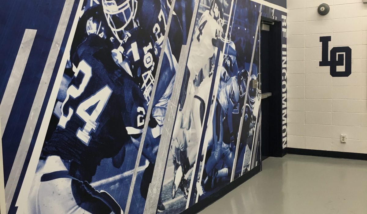
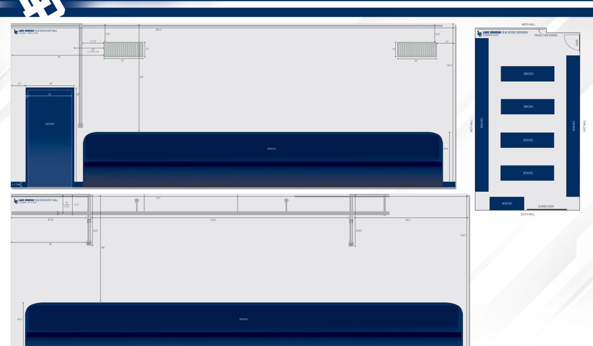
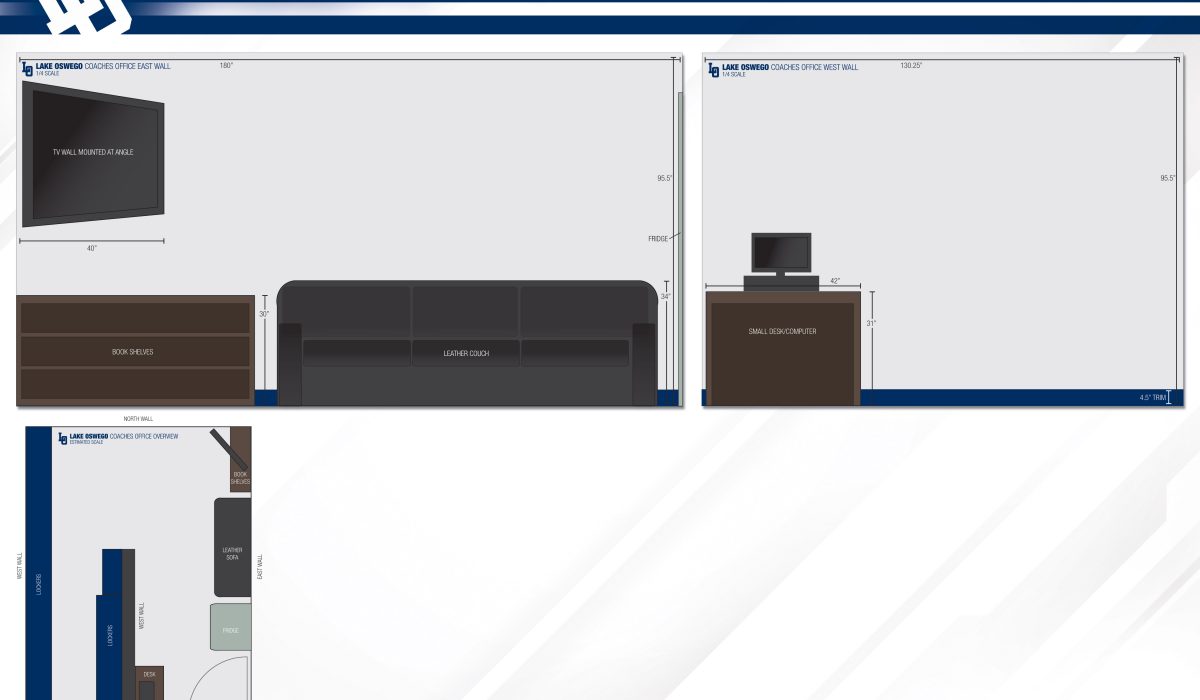
Lake Oswego Locker Room
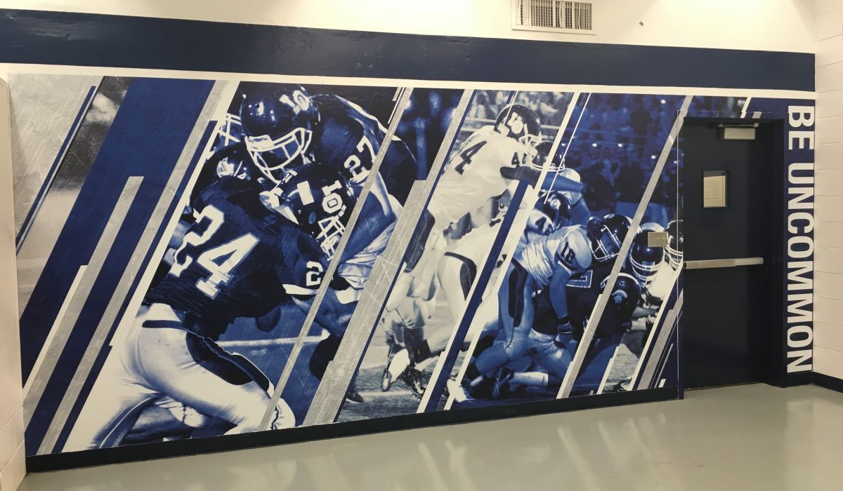
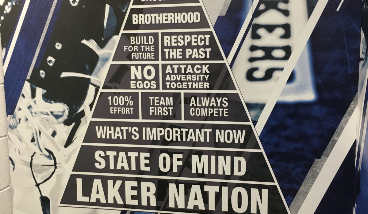
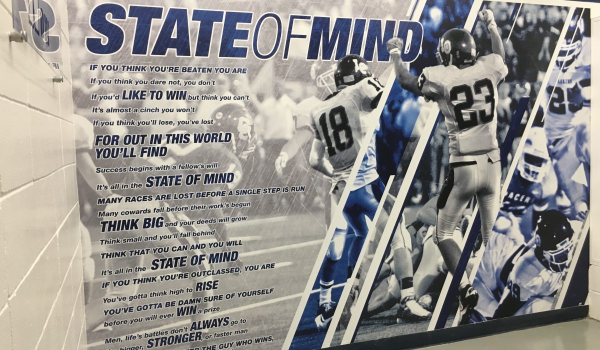
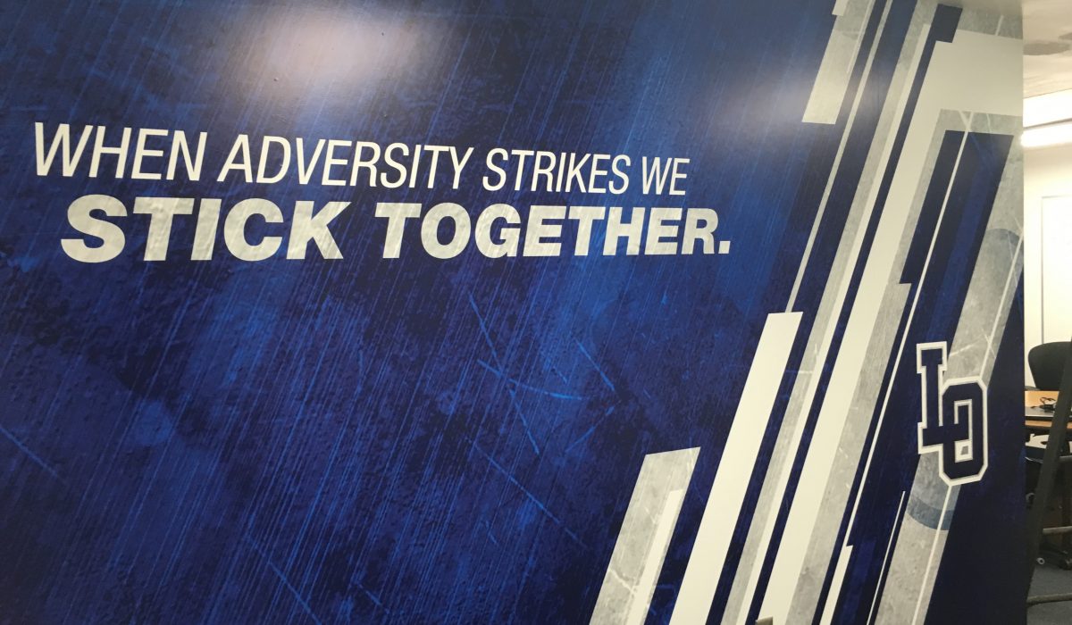
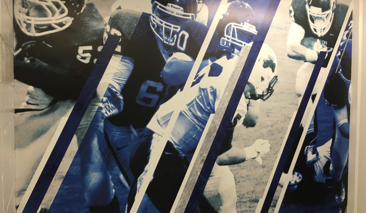
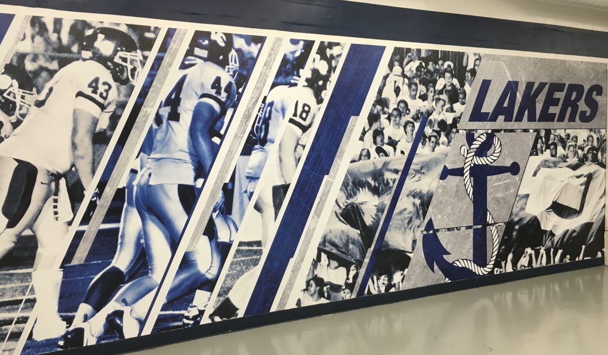
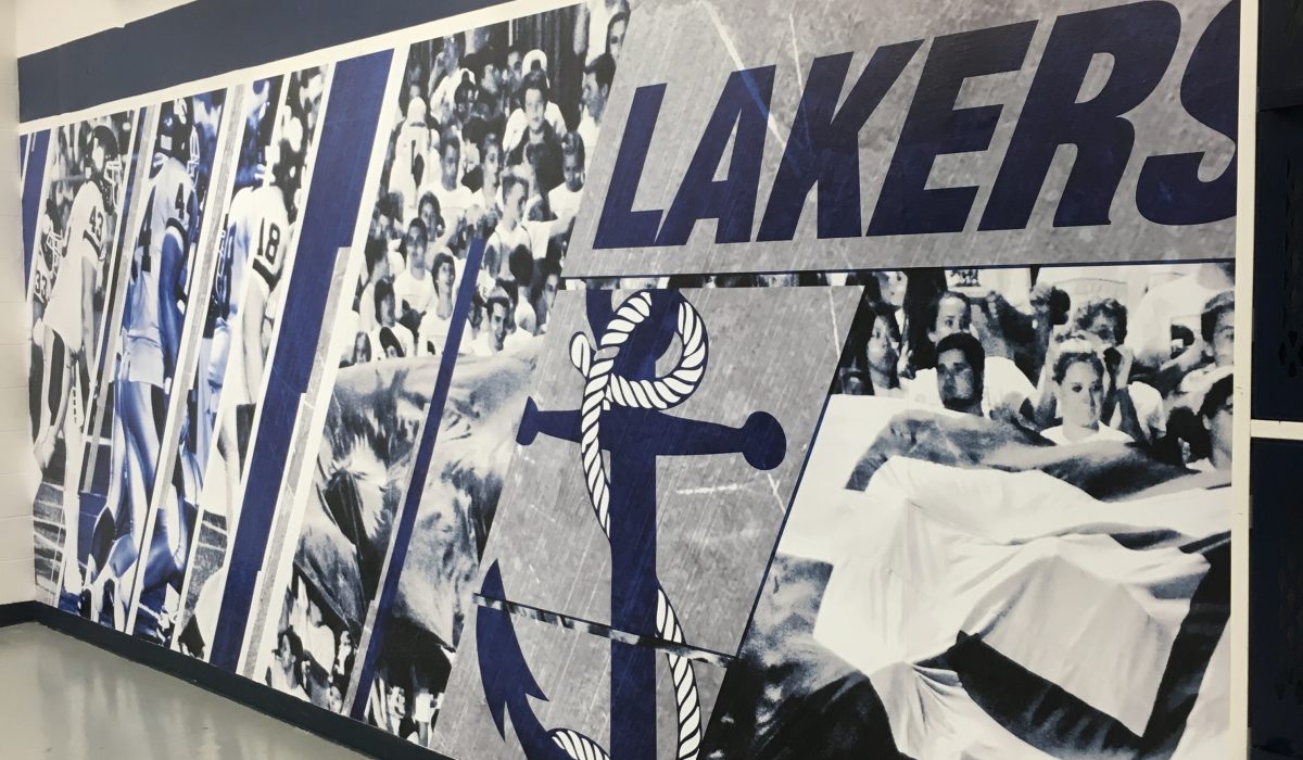
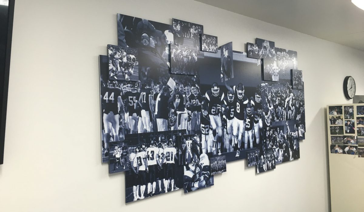
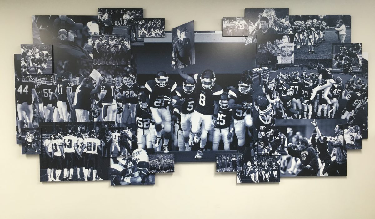
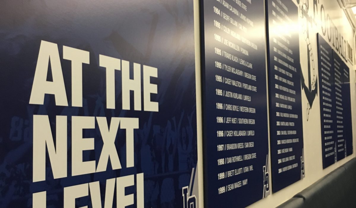
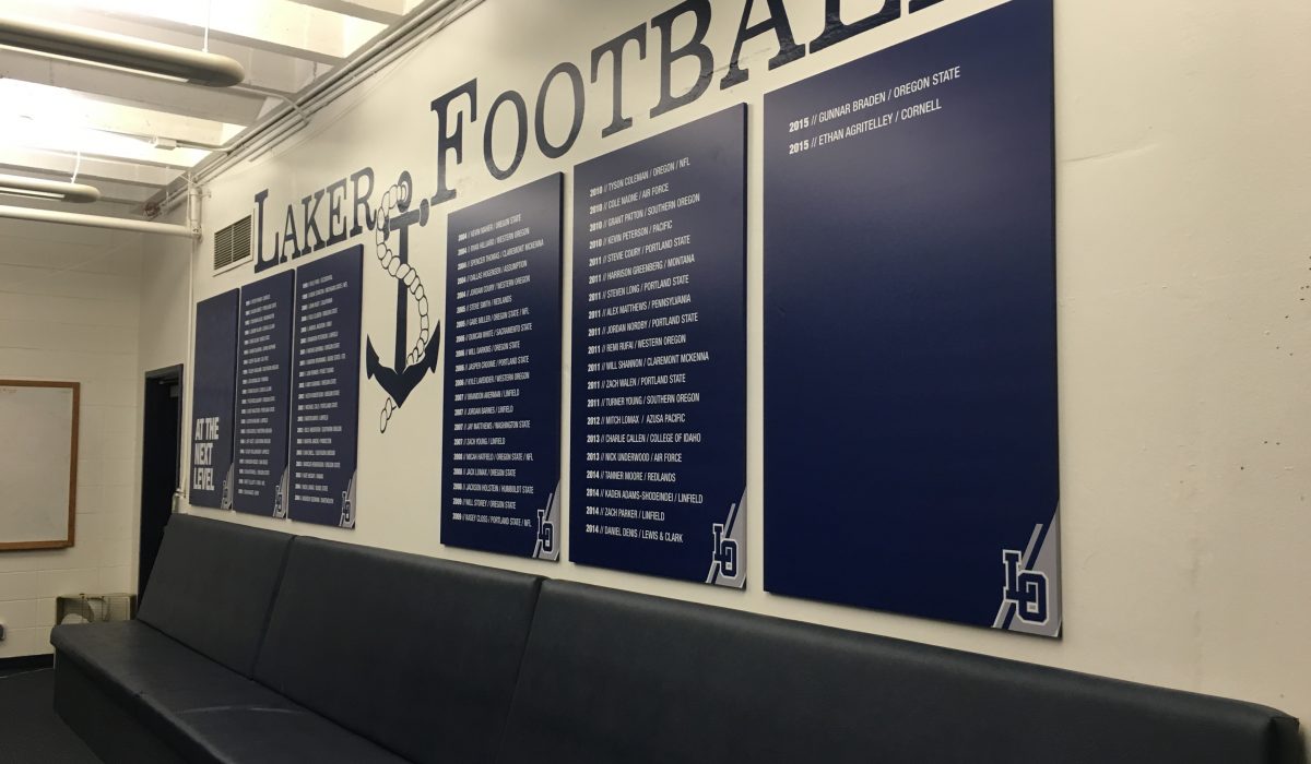
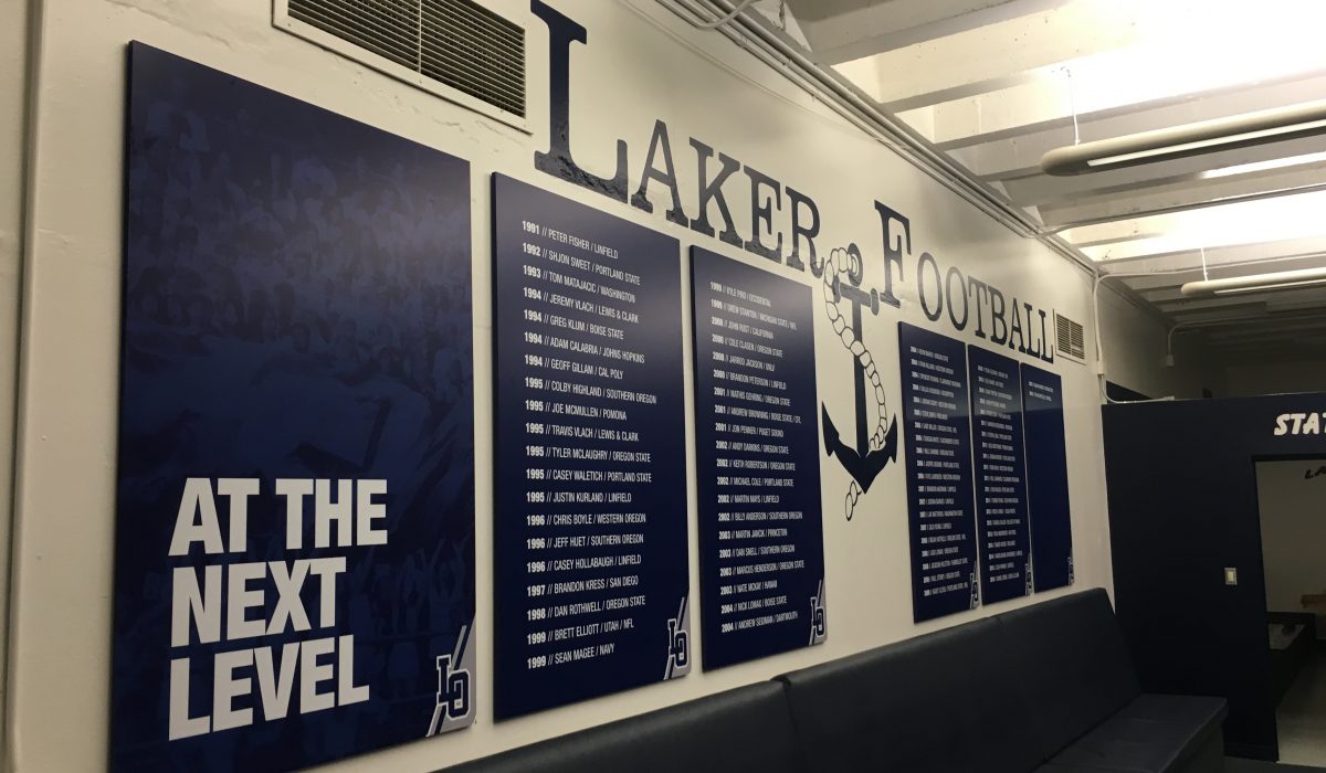
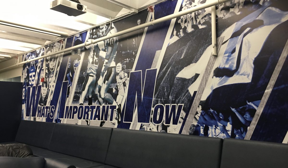
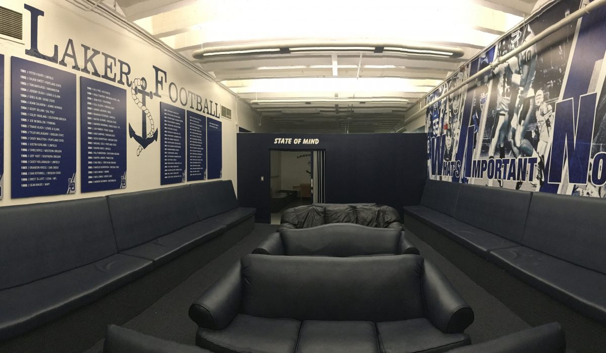
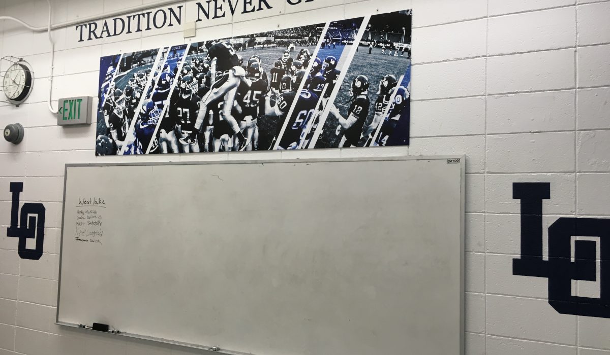
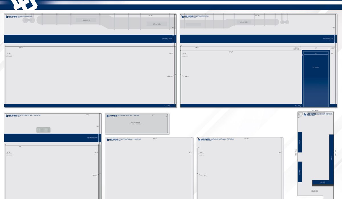
The Lake Oswego football locker room installation was a collaboration project distributed between six of my fellow designers, myself included. Each of us was given a portion of the locker room to design. The coach provided us with several photos to choose from as well as the school motto, colors, and mascot to create unity throughout. We cohesively decided to use duotone on the photos, and a concrete grunge texture and slanted stripes to create movement and a seamless flow between collages. The first wall displayed, is my portion of the project. Designing a wall with a door in it can be tricky when dealing with image placement. On the right side of the door frame, I felt another image would have been unrecognizable. Therefore, I decided to use the school’s motto, “BE UNCOMMON.” The installment turned out great, and the door text portion received favorability from the football coach, as well as the rest of the locker room.
Read More ›
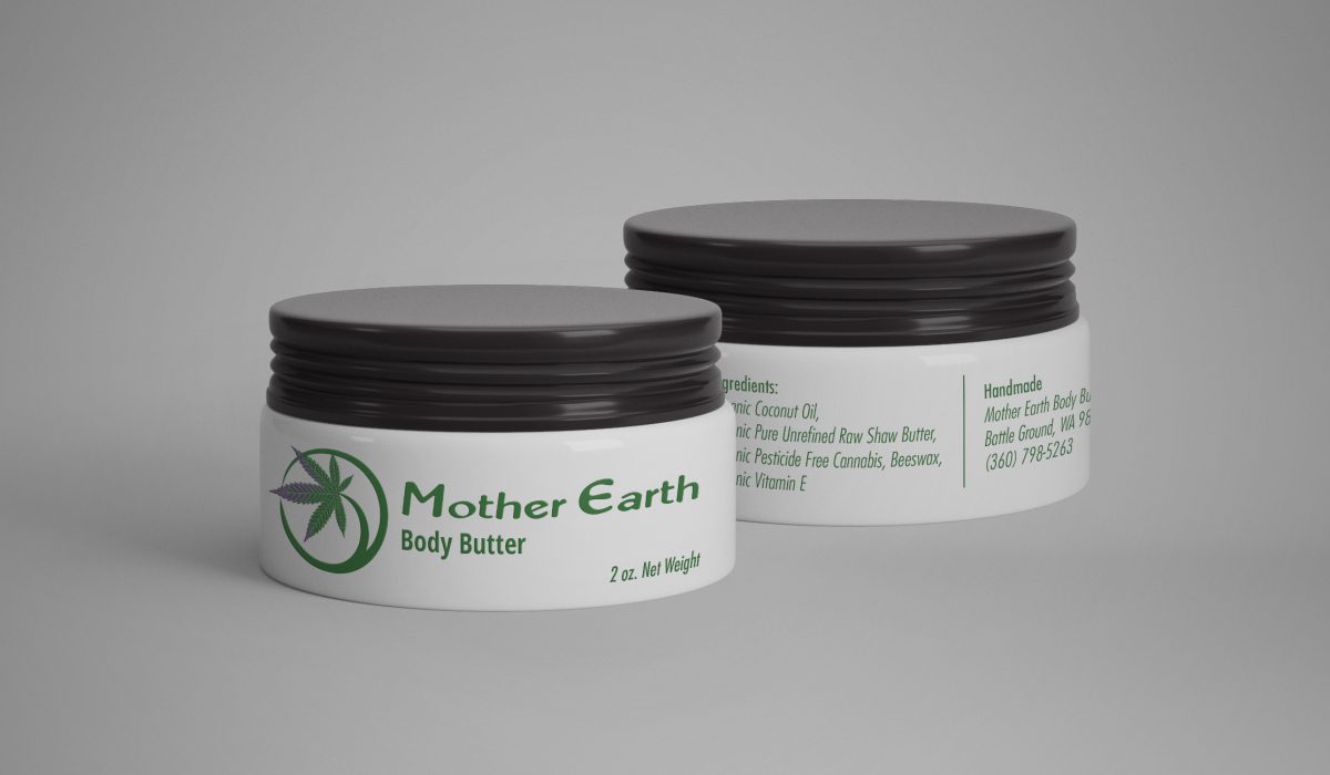
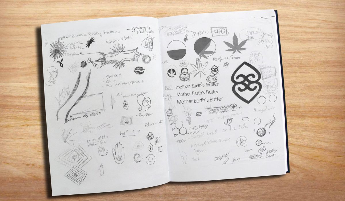
Mother Earth Body Butter
Concept: This was a logo I designed for a friend of mine who created his own organic, medicinal weed salve. I wanted something simple that resembled nature and the main product, marijuana. I chose a free form circle to represent the circle of life, and tied the two together with a marijuana leaf. The text I chose is an organic simple text to tie the whole logo together.
Read More ›