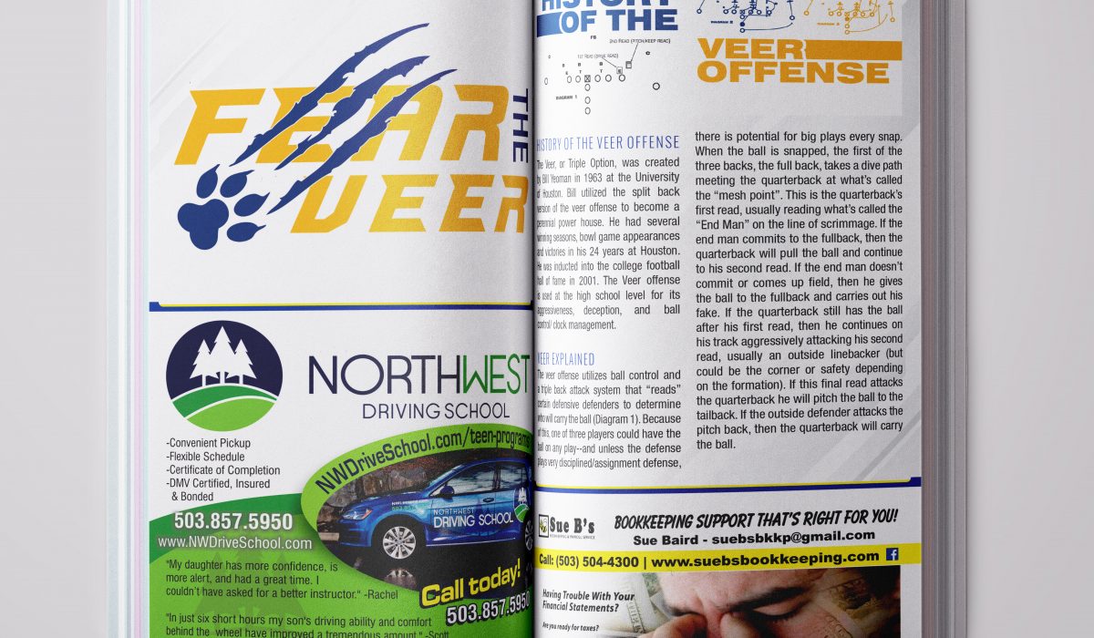
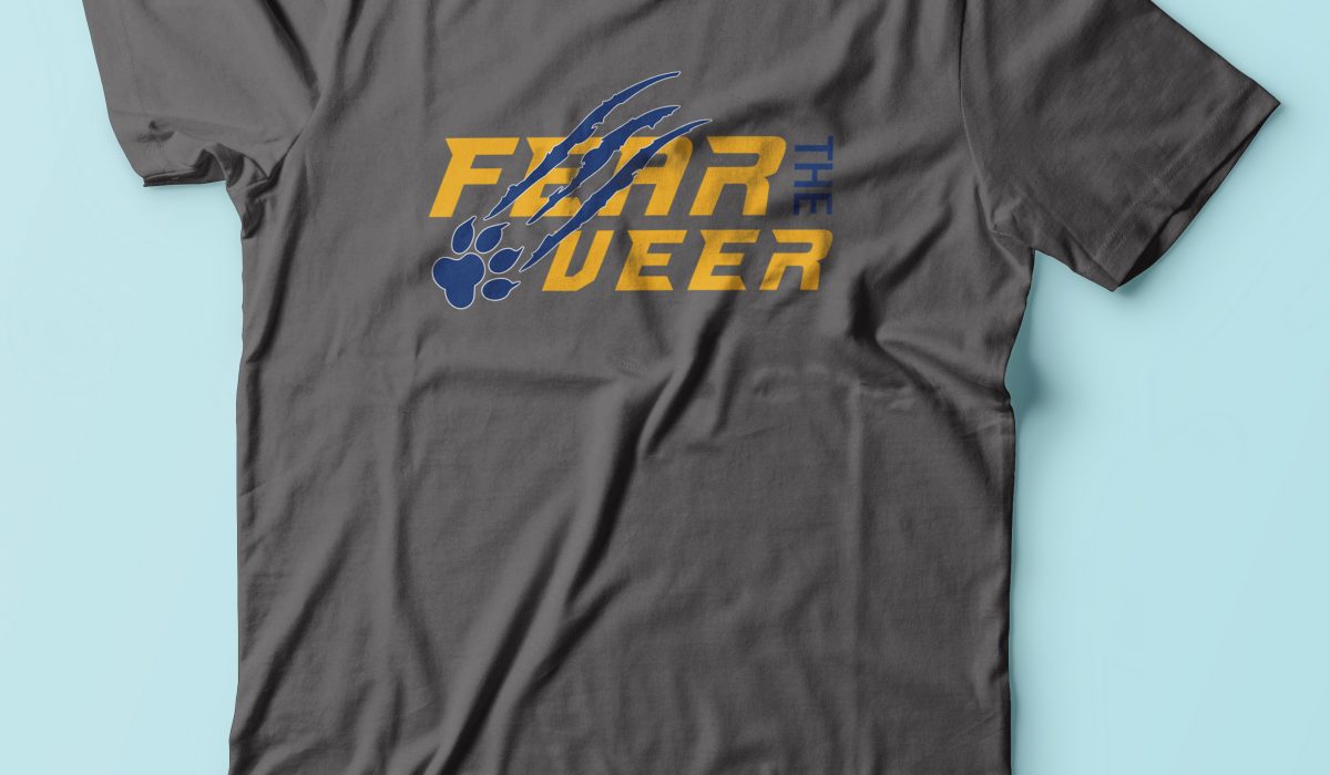
Fear The Veer
Concept: Newberg High School Logo, “Fear The Veer:” Fear the Veer, was a logo I designed for Newberg High School in reference to one of their adopted football plays, “The Veer” or “Triple Option,” was created by Bill Yeoman in 1963, at the University of Houston. The Veer offense is used at the high school level for its aggressiveness, deception, and ball control/clock management. There are several formations that can be utilized to run the veer offense: the split back, wishbone, flex-bone, shotgun, pistol, and the “I” formation, (and its variants the Power “I” & Maryland “I”) Neweberg utilizes the “I” formation. I wanted an action looking font and ended up using Richardson Brand Accelerator font, with some alterations. I incorporated their logo, the paw print, and added tear marks threw the text to enhance the tiger logo.
Read More ›
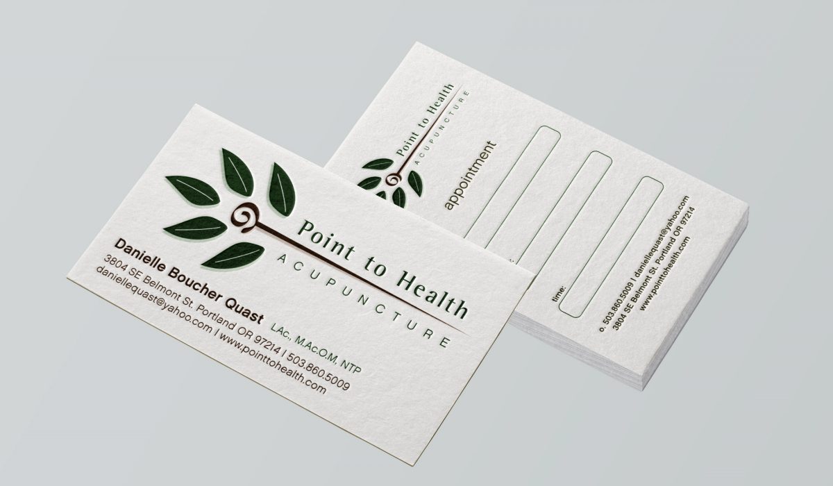
Point To Health Acupuncture
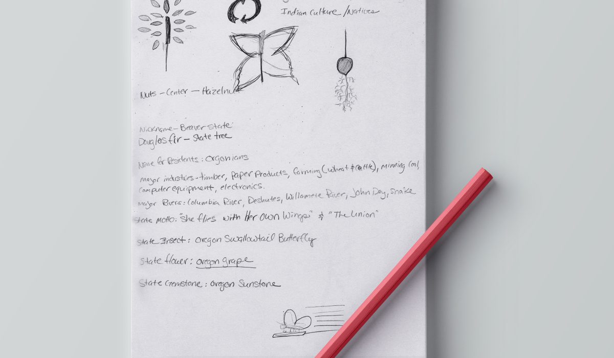
Concept: I was looking for a more natural logo that compliments acupuncture considering it is one of many organic alternative forms of medicine. I found a similar image, but modified it by forming a needle in place of a plant stem or tree trunk. The spiral represents the circle of life and health. The leaves tie the whole logo together. I used organic rich browns, greens and a splash of violet for color.
Read More ›